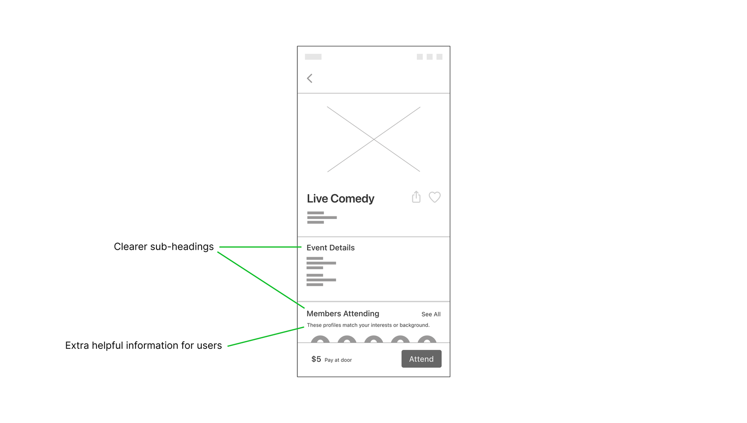
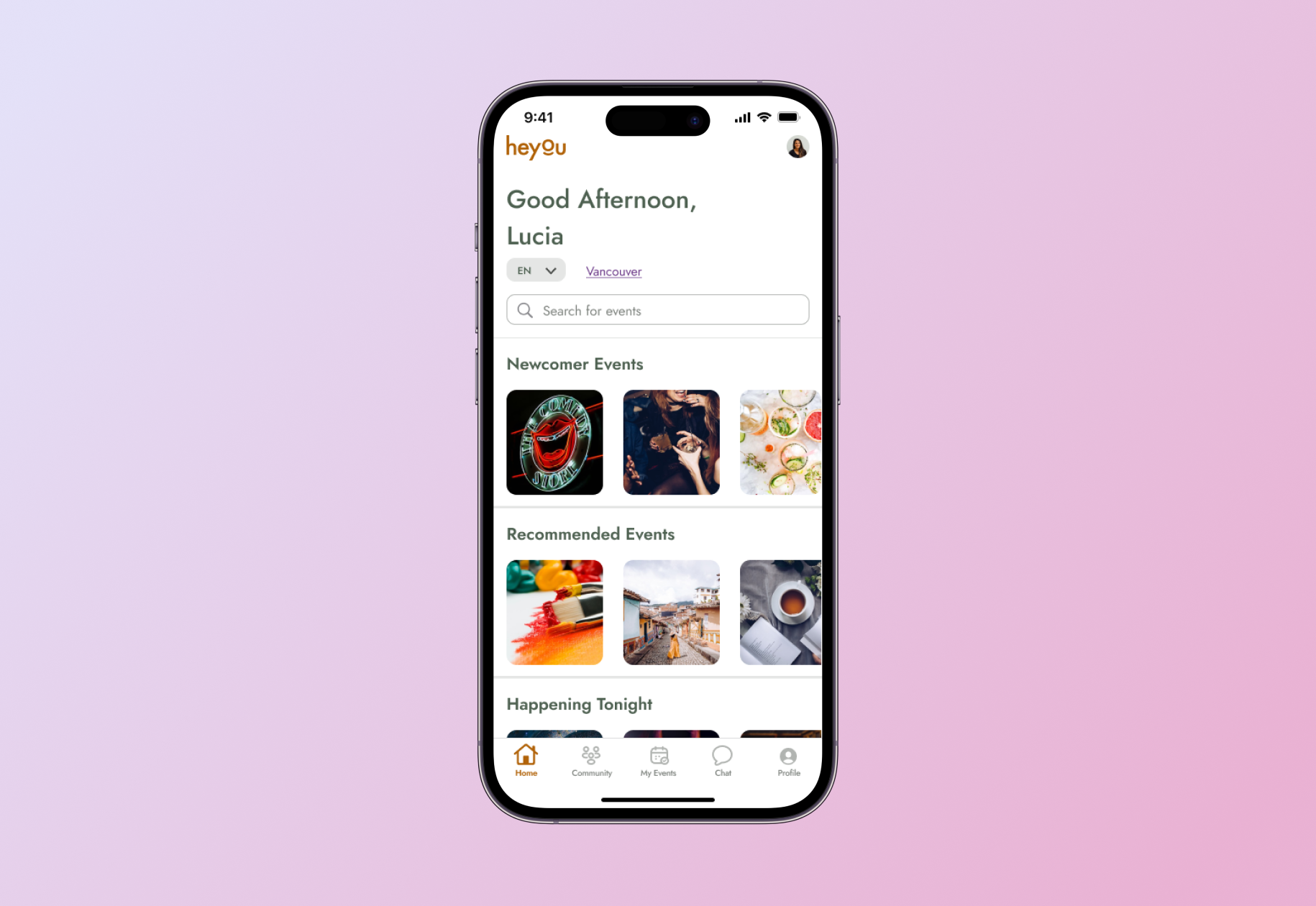
Mobile App UX Writing

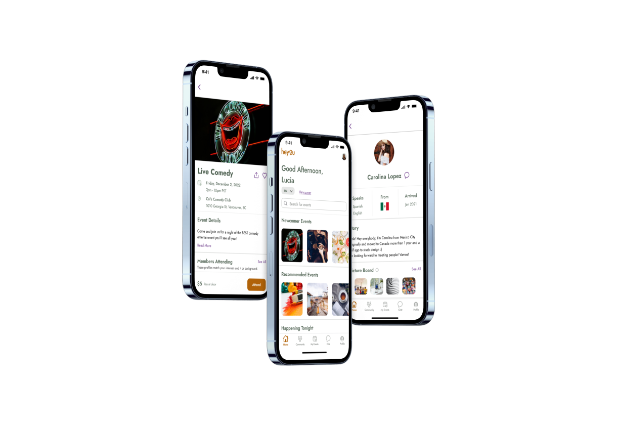
Heyou is an events’ app designed specifically for immigrants to meet and connect with like-minded people through shared experiences in their city.

This project was part of my studies at Brainstation and was presented in our final showcase in front of staff, alumni and people from the tech industry.

Contribution

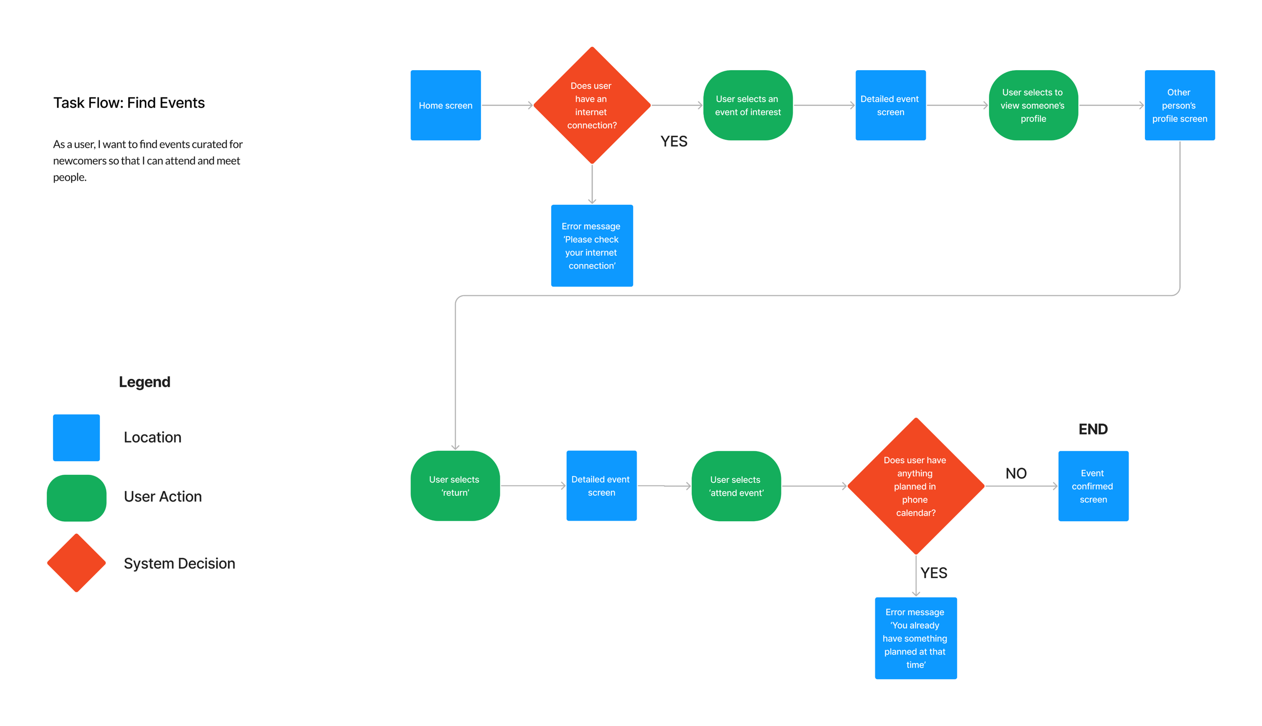
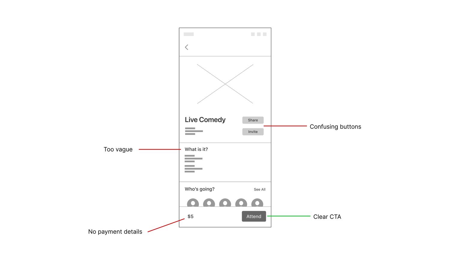
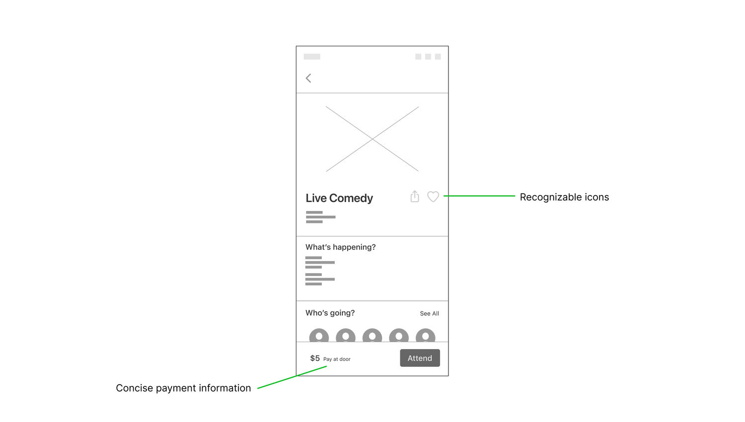
User interviews, wire-framing, writing, content organization, prototyping, user testing, communication

Final screens.

Overview

Problem

Immigrants struggle to re-build social networks and report feelings of social isolation. Current socializing apps facilitate events but don’t encourage real connection.


Solution

Design an inclusive and welcoming app to help immigrants find connection through events. Ensure content is readable and copy reflects brand values and is pitched for target audience.

Flowchart of main use case.

Research

Secondary Research

I searched for pre-existing information about the topic of social isolation among immigrants to understand what had already been written and found three key concepts: relationship quality; loneliness and social support.


Primary Research

I conducted three interviews with people who represented the target users in an attempt to empathize with them and also challenge assumptions I had: it was hard to connect with others and people don’t know where to go to connect with others.

After compiling and sorting the data through the affinity-mapping process, I found three key themes:

Established Groups

Interviewees shared how difficult it was to join and socialize with pre-existing groups.

Shared Interests

A common method to meet others was through shared interests and a similar background.

Ineffective Socializing Apps

People stated that existing socializing apps are helpful by sharing events happening in the local area but they don’t encourage real connections.

Phase 1

Feedback from initial user testing highlighted that some copy was vague and there was limited helpful content, making it difficult for users to get what they needed from this screen. Users were confused by the different intentions of the ‘share’ and ‘invite’ buttons. Users also didn’t know when they were expected to pay for the event. The copy used for the main CTA was clear for users.

Description.

Phase 2

As there was little difference in the destination of the ‘share’ and ‘invite’ buttons, I adapted this idea slightly. I researched other social-networking apps and saw that two common actions used were ‘share’ and ‘favourite’ and rather than buttons, these were represented by icons.

So, I replaced the ‘share’ button with an industry standard icon for this action. For ‘favourite’, I used the heart icon - synonymous in apps with the action of saving something for later.

I adapted the vague What is it? sub-heading to What’s happening? so it focused on something occurring (the event). Users requested more clarity on when payment would be expected so I added Pay at door - keeping it short and informative.

Description

Phase 3

Another testing session revealed the sub-heading copy was still too vague for users so I prioritized clarity for these to reflect exactly what information the section included.

I realized that in trying to make the sub-heading copy conversational to support the welcoming and inclusive values of the app, the copy had lost clarity and therefore usefulness. I added some microcopy under the Members Attending sub-heading to help users understand why certain profiles appeared there.

Description

Final

I wanted to add the option of ‘and / or’ to the microcopy under the Members Attending section rather than simply ‘or’ (which it was previously) to increase inclusivity. I also added some copy under the Event Details section with the goal of portraying a welcoming and upbeat tone of voice so users would feel more inclined to attend the event.

Next: Diary Study for King Arthur: Legends Rise